Colour breakdowns
The colour breakdowns have been prepared as a guide to producing specified colours, in different mediums. Please note: The colours printed throughout this booklet are intended as a guide, not to accurately match the Pantone Colour Standards. They will look different depending on how they are viewed and printed. What you see on your computer monitor may vary from what is printed on your office printer, and again from a professional print. Due to these variations it is recommended you match the relevant Pantone colours for complete accuracy.
PANTONE+ (PMS) and CMYK – used for professionally printed material.
sRGB – used in screen applications i.e. Word documents.
Web hexadecimal – used in screen applications, primarily for web publication.
All colour codes were generated from within Adobe Illustrator using the PANTONE+ Colour Bridge Coated swatch book. Illustrator was chosen as the most efficient industry-standard program for producing colour codes for a range of outputs; while Colour bridge is designed to retain consistency when changing between colour spaces/medium outputs. Note that colours are subject to a number of variables, including monitor brightness, contrast and calibration and individual program colour profiles.
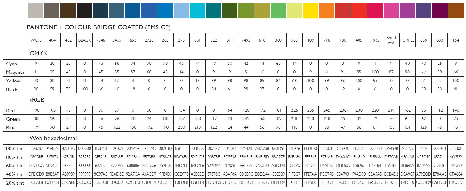 Design colour palette break downs |